Welcome To Winona
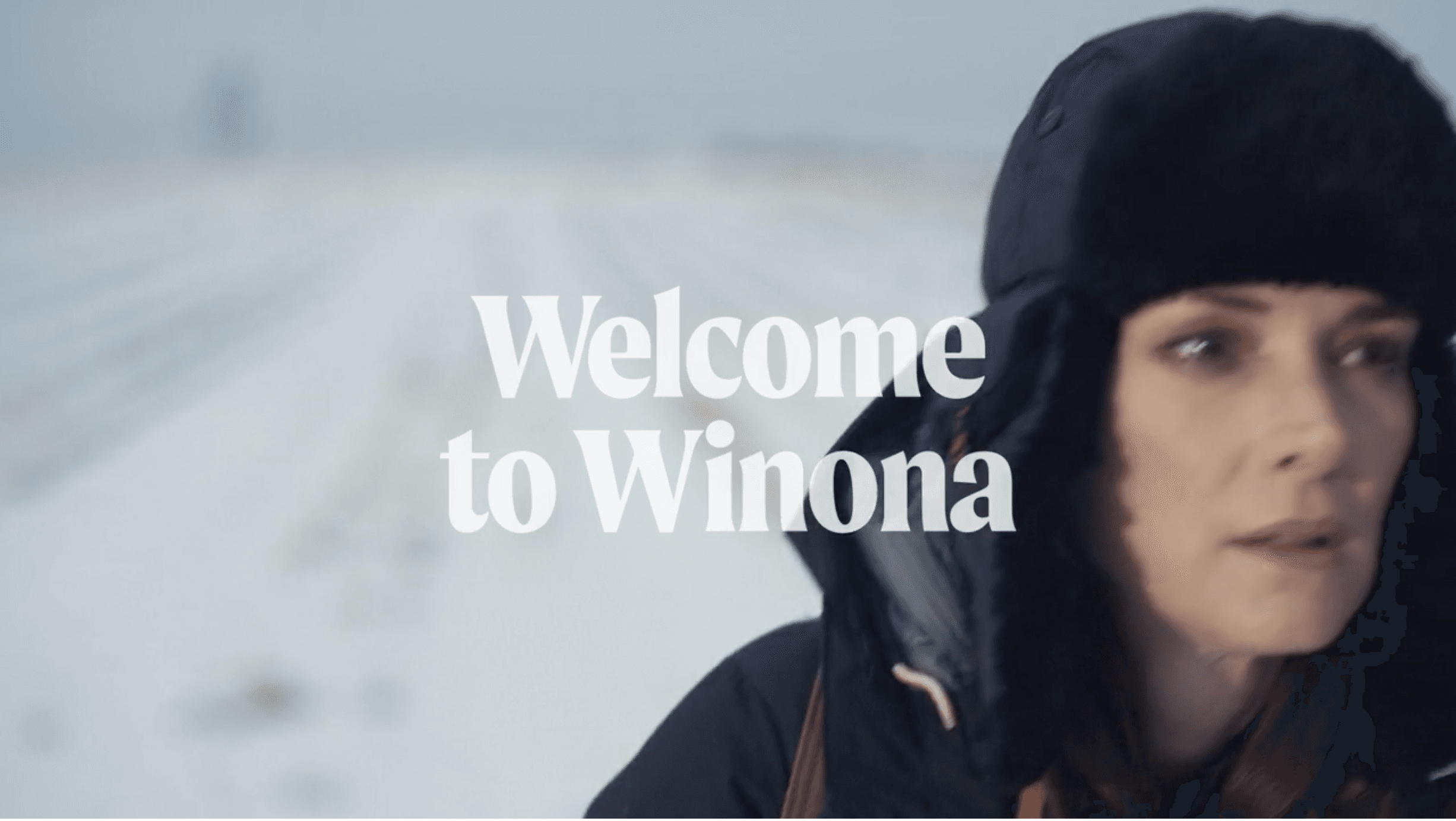
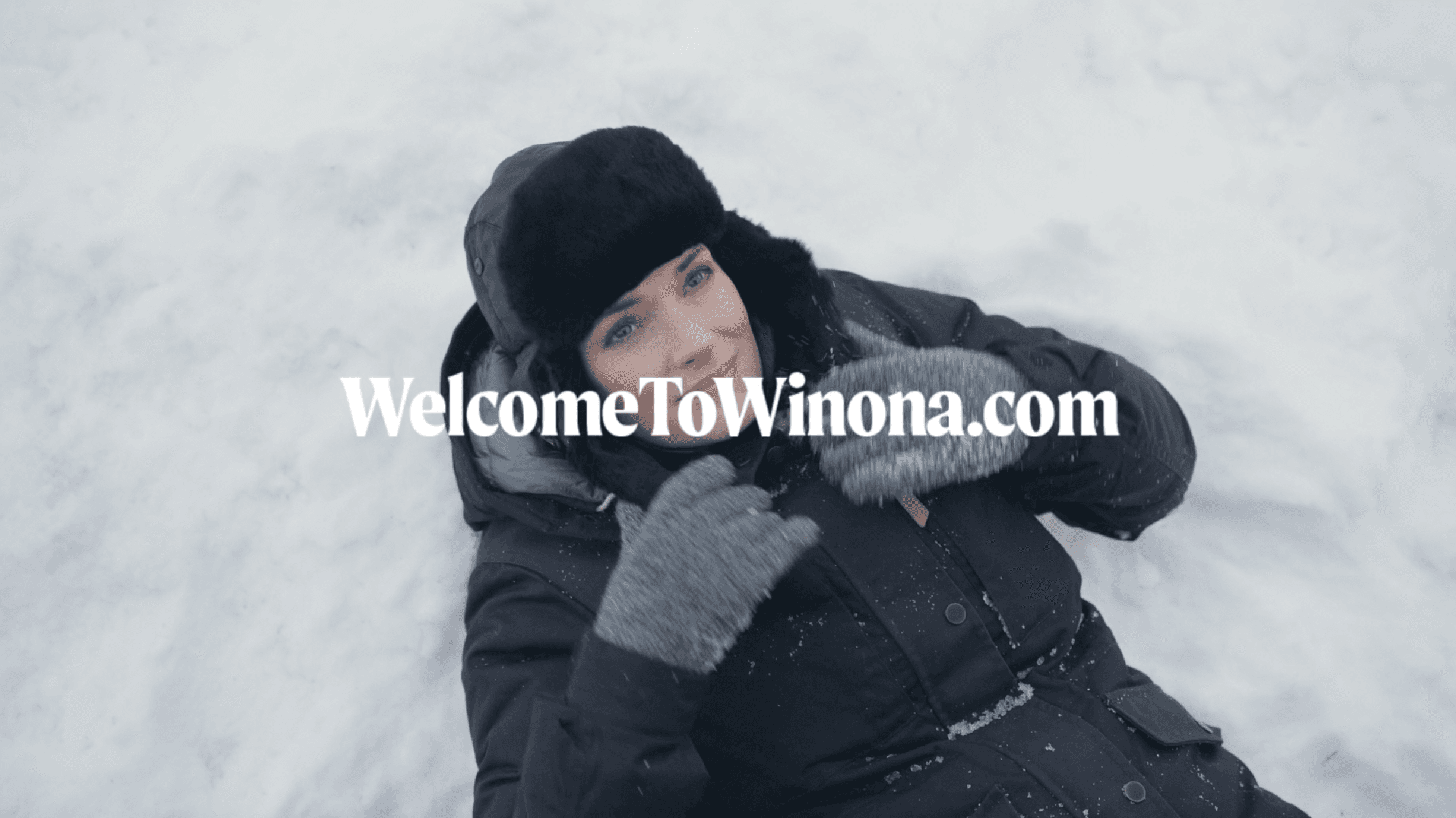
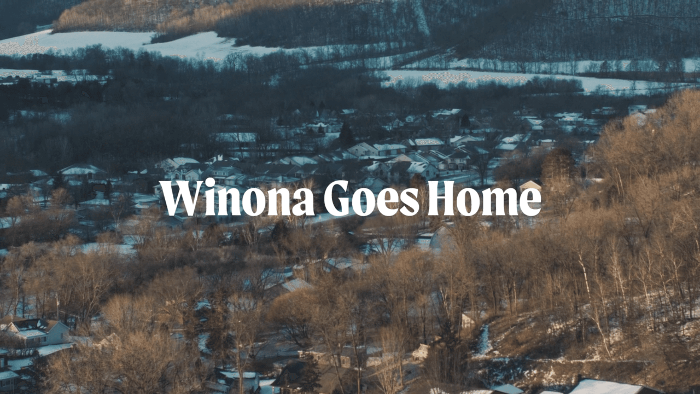
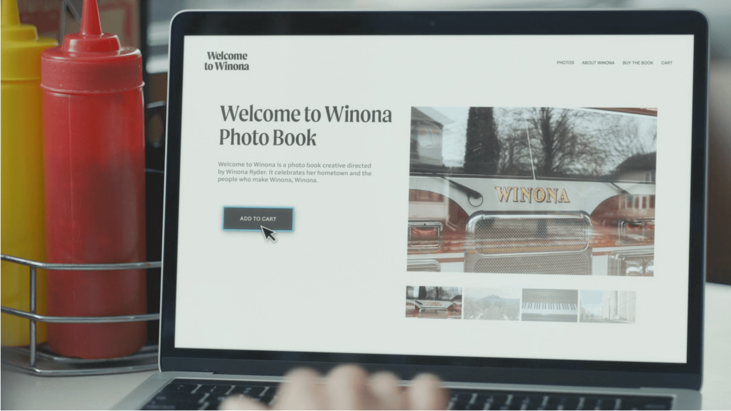
Moret brings its expressive serif character to Squarespace’s Welcome to Winona campaign, adding warmth and personality to the brand’s distinctive visual storytelling.
Moret was selected for Squarespace’s Welcome to Winona campaign, a project inspired by the character, community and independent businesses of Winona, Minnesota. The typeface’s expressive forms provided a natural connection to traditional American sign painting while retaining a contemporary quality suited to the campaign.
“While researching typefaces, the team always knew that we needed something that could bring forward the feeling of an American town that still thrives on community and mom and pop stores. We really felt that Moret was a perfect fit because of its nod to sign painting, while still having calligraphy roots that spoke to the town's rich history. It also provided us with a tonal range that felt unique enough to the town itself without going to the campy side (which is so easy to do when quoting this kind of vernacular).”
— Ben Hughes, VP Brand Design, Squarespace
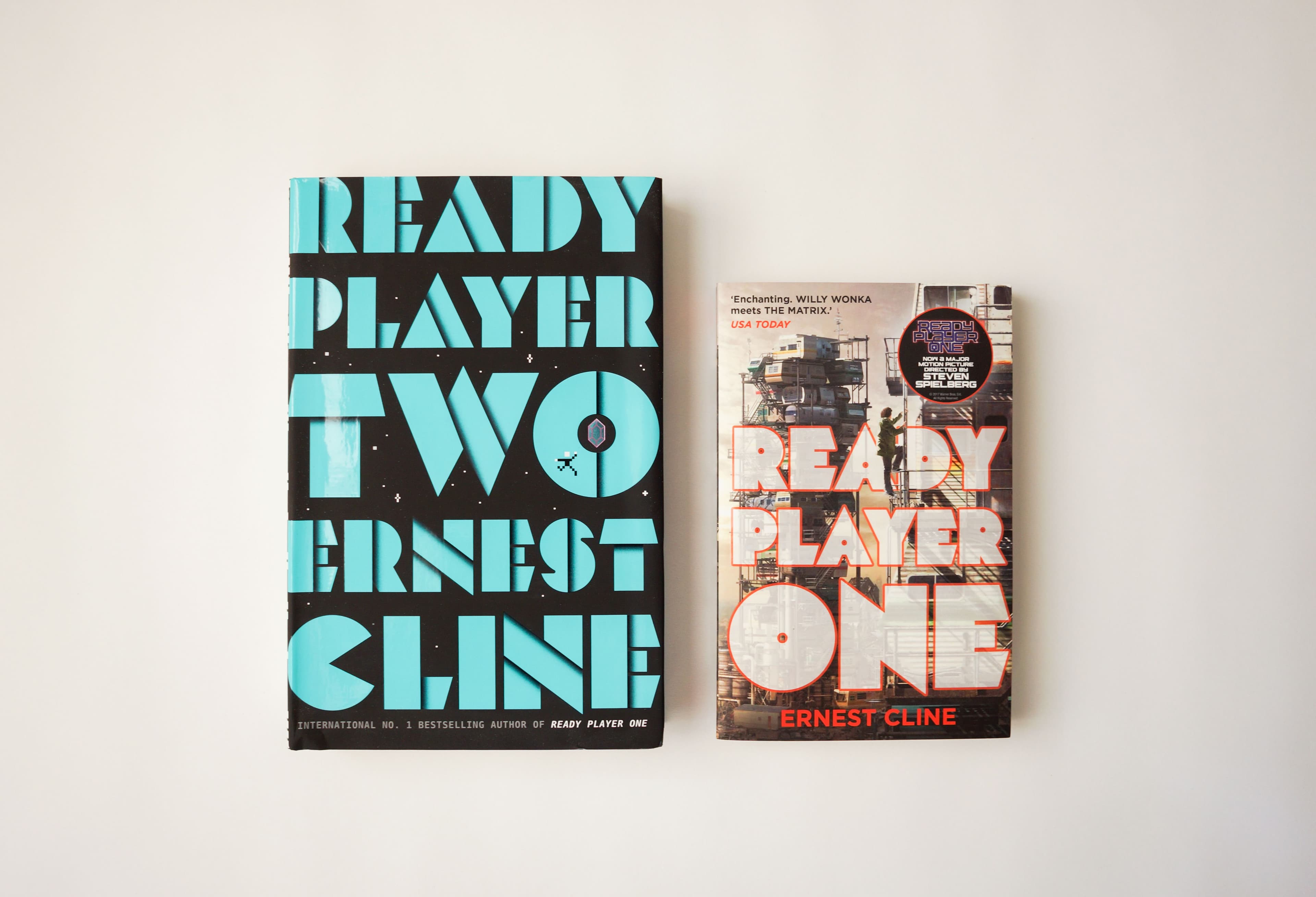
Mekon's distinctive geometric letterforms take centre stage on the covers of Ernest Cline's bestselling science-fiction novels, Ready Player One and Ready Player Two.
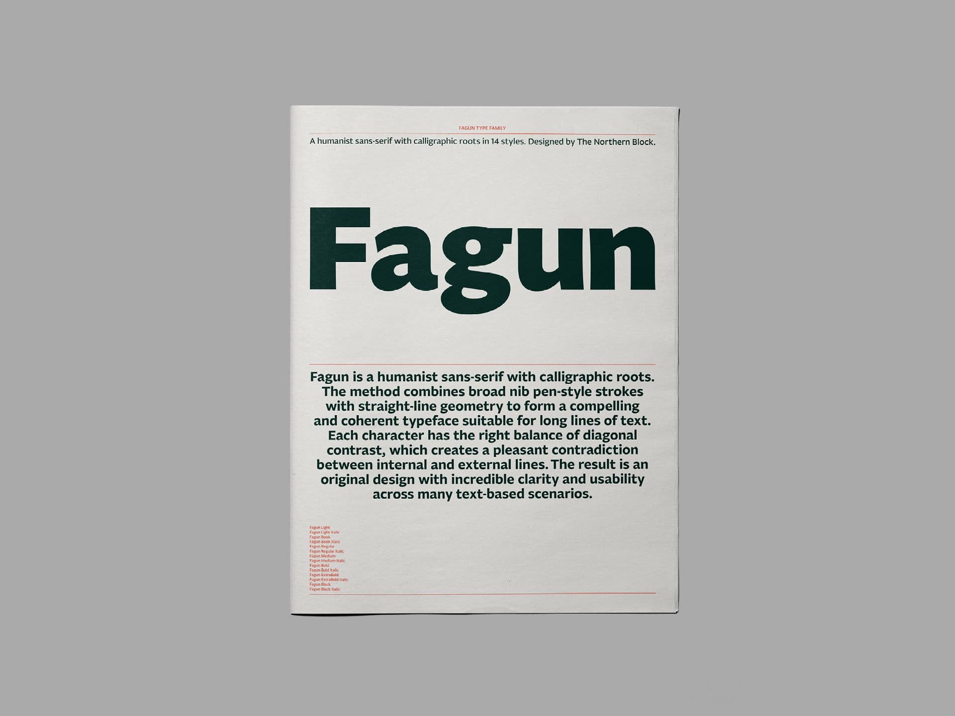
A 44-page newspaper specimen exploring Fagun's 14 styles and extensive typographic features, with a visual concept inspired by the novels and characters of Charles Dickens.
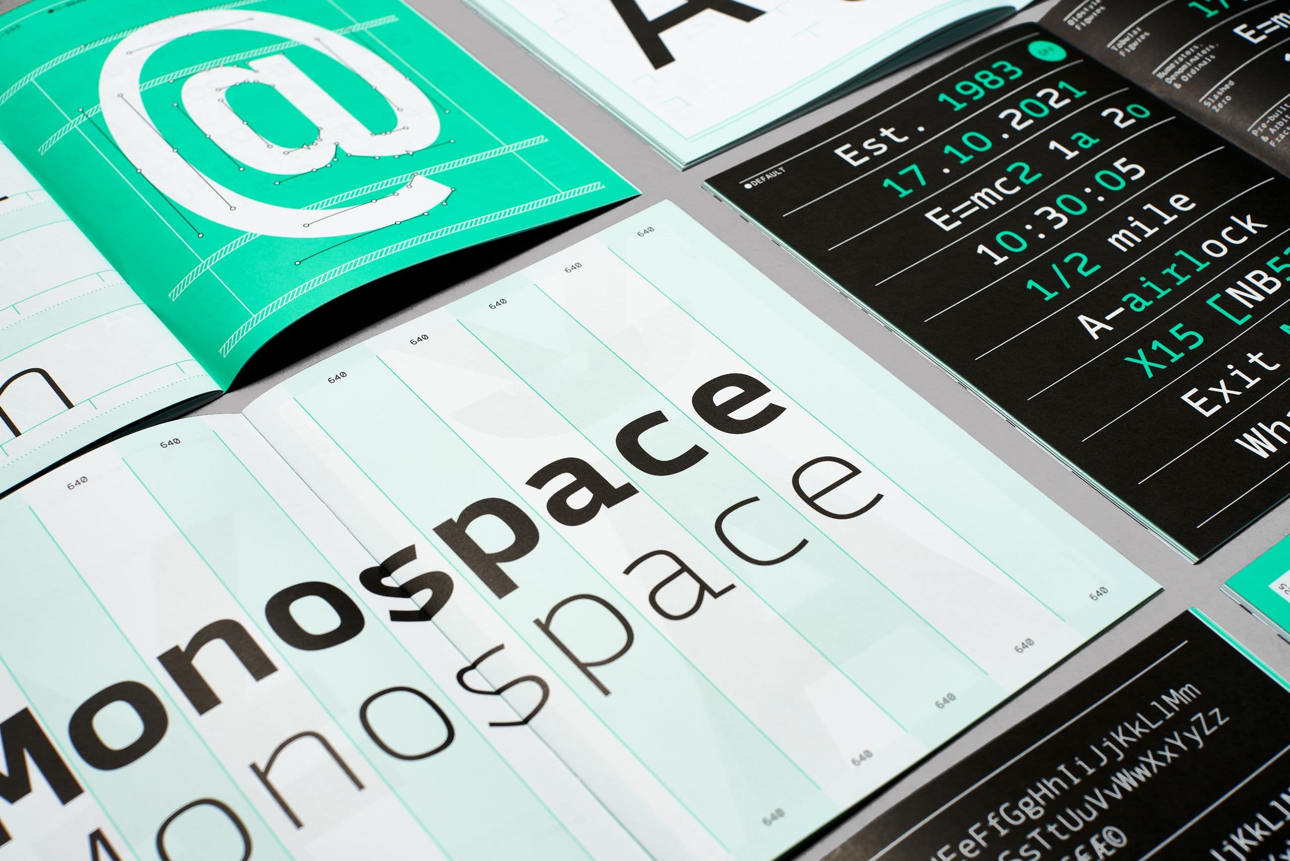
A 40-page printed specimen exploring Syke Mono's expanded family of ten styles, with a visual identity inspired by dot matrix printing and traditional continuous-feed paper.